Outlier Detection in Time Series with Kats and Comet
Introduction
Time series applications are ubiquitous and find applications in various industries such as supply chain, e-commerce, finance, retail, biotechnology, weather prediction, oil and energy, manufacturing, astronomy, etc. These applications generate data that can be noisy in the real world as some unaccounted factors can influence the measurements. For example, readings of the sensors used to measure the temperature or pressure in an automobile manufacturing plant might get impacted by weather conditions, several entries, exits of personnel, or a faulty apparatus.
This post will focus on outlier detection and interpolation in time series data using the Facebook Kats library. You will learn to log the visualizations in the Comet.ml project.
Facebook Kats
There are many open-source libraries for analyzing time series data, such as Sktime, Darts, Prophet, Pyflux, Tsfresh, Flint, Arrow, Kats, Pastas, Orbit, etc. In this post, you will learn to use the Kats library due to its lightweight, generalizable, and easy-to-use framework.

In addition to univariate and multivariate analysis, it offers various analysis and preprocessing functionalities such as:
- Forecasting: It has a ton of tools for prediction, such as classical ones like ARIMA, ARMA, SARIMA, etc, and modern forecasting models like Prophet. It also offers ensembles, meta-learning algorithms, hyperparameter tuning using grid search, backtesting, and empirical prediction intervals.
- Outlier and Change Point Detection: It identifies patterns such as trend, seasonality, outlier, and change point.
- Feature Engineering: The TSFeature module can generate many statistical features used in classification and regression models.
- Utilities: Kats provides time series simulators for experimentation.
Installation is as easy as:
pip install kats
Comet
Comet’s machine learning platform is an interactive tool that integrates with your existing infrastructure and tools to make managing, visualizing, and optimizing models easier and faster. It allows seamless collaboration in multi-geographical teams by enabling experiment logging, git commits, experiment comparison, and reproducibility.

Not only easy to use, but it is also customizable to your team’s preferences and provides support for all well-known machine learning libraries out of the box. For others, there are always a few lines of code and you are good to go.
For installation run the below command in your terminal:
pip install comet_ml
Now that you have the comet_ml library installed, let’s create a Comet account to get logging!
Creating your Comet Project
If you are new to Comet, open comet.com and click on “Create Free account.”
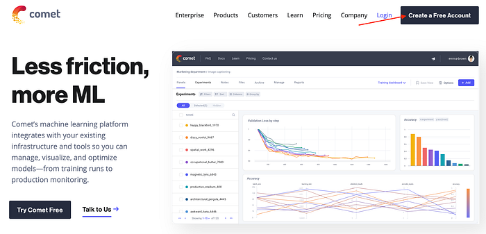
You can either sign up with your GitHub account or just use your email address.

Next, you can create a new project by clicking on “+ New Project” and adding in the project name, description, and whether to keep it private or share it publicly.

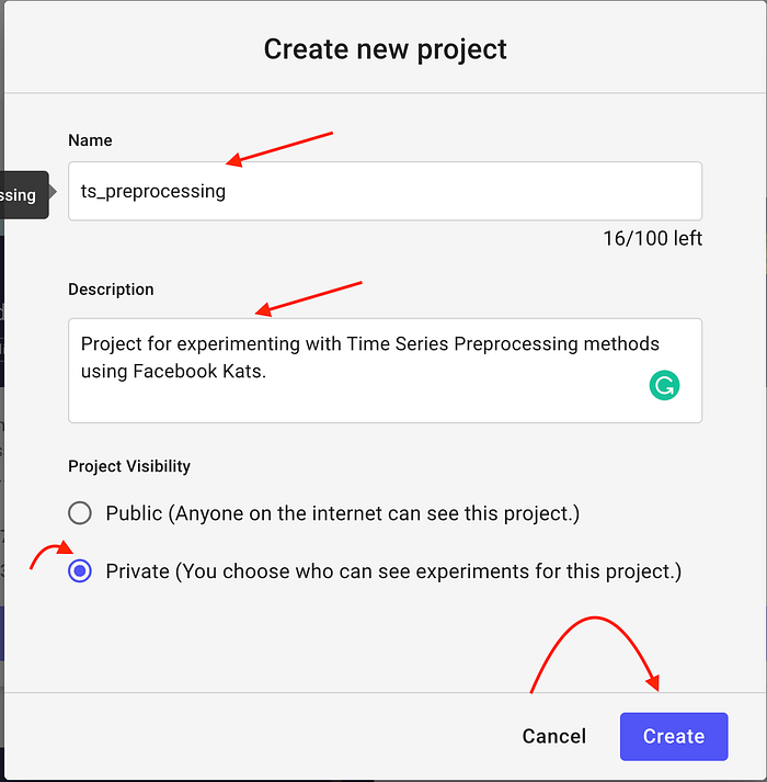
Click on “Quick Start Guide” to reach the setup instructions page where you will find your API key.

Logging Visualizations
Before you start writing the code, you need to add the following lines of code at the top of your Python script or Jupyter notebook.
from comet_ml import Experimentexperiment = Experiment(
    api_key="add your api key here",
    project_name="add your project name here",
    workspace="add your workspace name here",
)
Now that you have your tools sorted, let’s get to the business. You will be experimenting with the popular Air Passenger data which has seasonality and trend, apart from the Autoregressive and Moving Average features.
Curious to try Comet on your own? Sign up for your free account today!
Data Preparation
You need to convert a Pandas Data Frame to a Time Series Data format using the “TimeSeriesData” method. Also, it requires the time dimension and the value dimension, which would require you to rename the Data Frame columns.
Let’s do this step by step.
Import Required Libraries
import pandas as pd
import matplotlib.pyplot as plt
from kats.consts import TimeSeriesData
Read CSV data and view the top five rows.
ap_df = pd.read_csv("AirPassengers.csv")
ap_df.head()
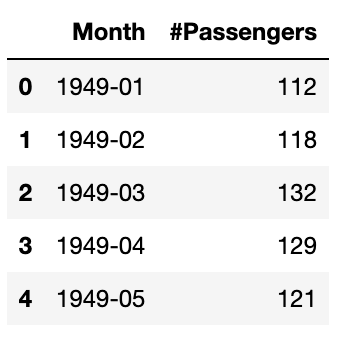
This looks great: you have monthly air passenger numbers from January 1949 to December 1960. You can get this by:
# Start month in the Data Frame
ap_df.min()# End month in the Date Frame
ap_df.max()
Plot the Air Passenger data.
Set the figure size as per your need, then plot a line chart, and finally log your chart to the experiment in the Comet project using log_figure(). This can be viewed under the “Graphics” tab in the project web interface.

Code for plotting and logging the figure is as under:
plt.figure(figsize=(35,20))
fig = plt.plot(ap_df['Month'], ap_df["#Passengers"])
plt.xticks(rotation=90)
experiment.log_figure(figure_name = "Complete Data", figure=fig, overwrite=False)

From the chart, you can observe that there is an increasing trend in the number of air passengers along with an overall increase in the amplitude of variation in yearly traffic. As expected, air travel has a 12-month seasonality.
Outlier Detection
Air Passenger data is a model dataset which doesn’t contain any anomalies or outliers. For the purpose of this exercise, let’s add an artificial outlier and observe if Kats is able to find the mouse. Uh oh! the outlier!
Let’s change one of the values in the Data Frame to a very large value i.e. 700 in this case.
ap_df['#Passengers'][50]=700
Let’s visualize the data to represent the outlier.
plt.figure(figsize=(15,10))
fig = plt.plot(ap_df['Month'], ap_df["#Passengers"])
experiment.log_figure(figure_name = "Complete Data with Anomaly", figure=fig, overwrite=False)
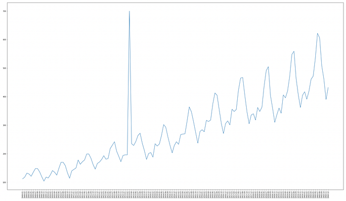
For using Kats, let’s do the following:
- Convert the ‘Month’ column to the DateTime format.
- Rename the columns in the data frame to ‘time’ and ‘value’ respectively.
- Convert data frame object to Time Series data object.
- Then use the Outlier Detector method to identify outliers.
- Now output the top one outlier at zero indexes of the detector object.
ap_df['Month'] = pd.to_datetime(ap_df['Month'])
ap_df.columns = ['time', 'value']
outlier_ts = TimeSeriesData(ap_df)
ts_outlierDetection = OutlierDetector(outlier_ts, 'multiplicative')
ts_outlierDetection.detector()ts_outlierDetection.outliers[0]

Once you identify an outlier you can either decide to remove it or replace it with another value. This is called interpolation. Use the code below to interpolate the outlier.
outlier_ts_interpolated = ts_outlierDetection.remover(interpolate = True)
Convert the Time Series Data object to the Data Frame object and rename the columns to the original names.
ap_df = outlier_ts_interpolated.to_dataframe()
ap_df.columns = ['Month', "#Passengers"]
Now, let’s visualize the data again to see if the outlier is interpolated well by the algorithm.
plt.figure(figsize=(15,10))
fig = plt.plot(ap_df['Month'], ap_df["#Passengers"])
experiment.log_figure(figure_name = "Anomaly Removed", figure=fig, overwrite=False)
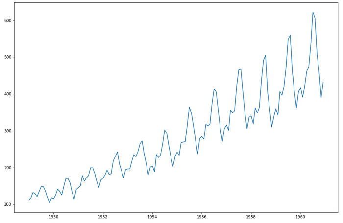
Voila! You got back the original clean data again.
Note: If you are using a notebook for running your experiments, don’t forget to call experiement.end() when you are done.
Summary
In this post, you learned how to handle outliers with the Facebook Kats library. You also learned how to create a free community account with comet.com and to log charts using Comet’s Python API.

