Introducing Comet’s New Image Panel
The Need for Visualization
For computer vision tasks such as segmentation, reconstruction, or object detection, it is imperative to visualize the model’s performance on your data. While tracking metrics such as loss and mAP are important , those values do not tell the whole story.
Comet has long provided its users the ability to log all relevant images to the graphics tab. The tab makes it easy to visualize model performance on your image data for a single experiment. Now, with our new feature, one can compare their model visualizations across multiple experiments!
Visualizing Autoencoders
Auto-encoders are powerful feature extractors and can be applied to anomaly detection use-cases and state space dimensionality reduction in Reinforcement Learning. When building an Auto-encoder model, there are a myriad of architectures, learning rates, loss calculations and other hyper-parameters to choose from.
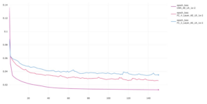
I see that in my new experiment, my reconstruction loss decreased when compared to my past two experiments. But to what extent did that make my reconstructed image similar to the original image?
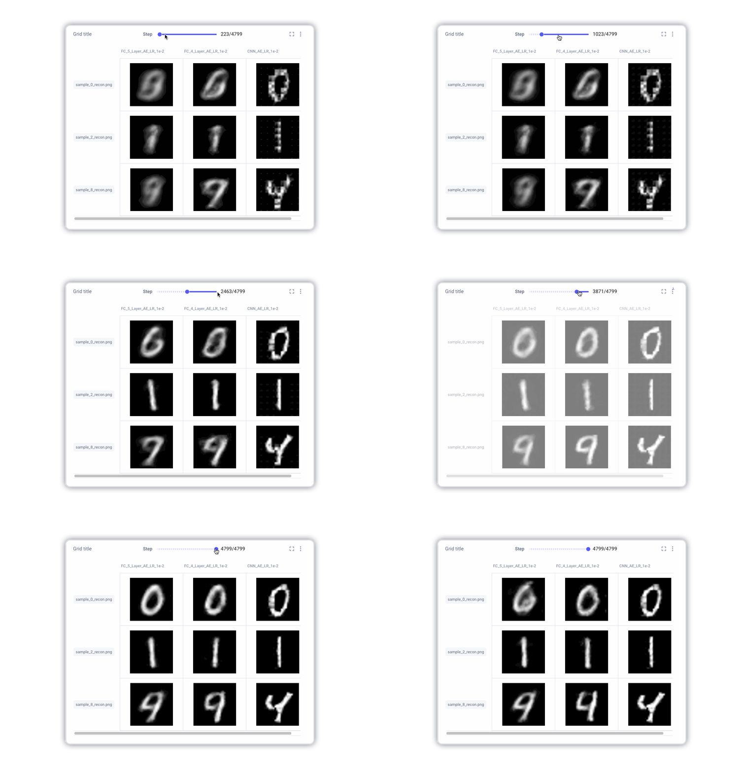
With the new Image Panel, engineers can visualize how their choices affect the autoencoder model’s ability to reconstruct the original side-by-side. In the image panel, search for your unique image names across your experiments, and create a grid spanning your different experiments in seconds.
The Image Panel not only enables users to visualize model predictions across experiments, but also to visualize their predictions throughout the training process. Using the stepper within the Image Panel allows one to see how multiple models are improving over time.
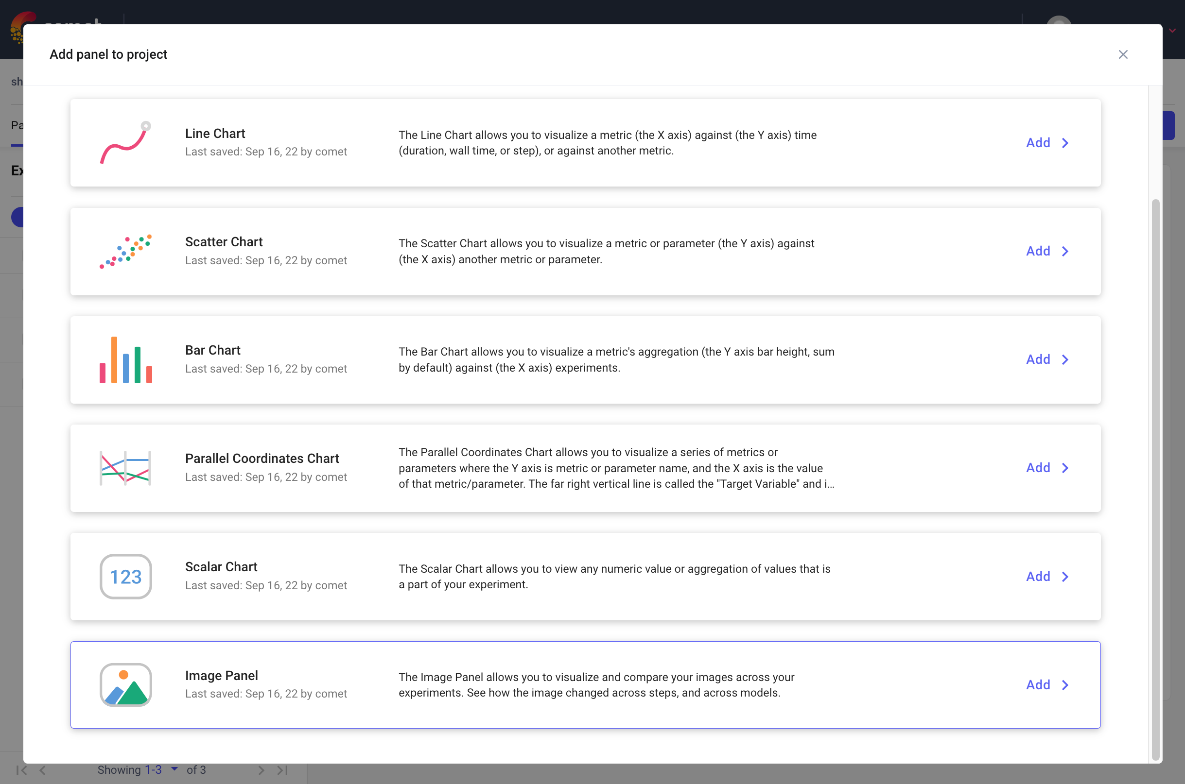
Where to find the Image Panel?
The Image Panel is a Built-in Panel! They can be found easily by clicking on the Add+ button and then selecting the New Panel option.
Want to see the new Image Panel?
You can check it out for yourself in the public project.

